Farmers markets are bustling hubs of local commerce, a kaleidoscope of colors, flavors, and personalities, all vying for a moment of the consumer's attention. But in this lively labyrinth, how do you make sure your vendor booth doesn't just blend into the background noise?
Think of your booth as more than just a selling space—it's a stage where your brand performs, capturing both eyes and imaginations. This article is your backstage pass to some of the most show-stopping, innovative, and downright irresistible farmer's market booth ideas you'll find anywhere.
From towering inflatable product replicas that make you do a double-take to heartwarming narratives that turn a simple purchase into a lasting memory, these vendors know how to turn their small plots of farmers market real estate into immersive brand experiences.
Whether you're a seasoned vendor looking for a fresh makeover or a first-timer eager to make an indelible impression, this article serves as your playbook. We've harvested insights from standout booths all over North America to offer you a banquet of ideas, designed to elevate your brand from forgettable to unforgettable.
Supersized Promotions: The Impact of Inflatable Product Displays
Shop Inflatable Advertising Products
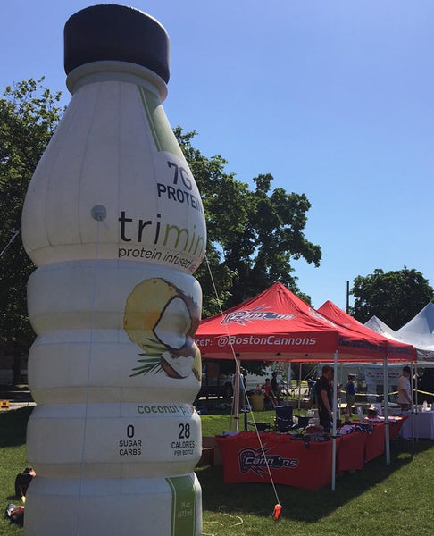
Transforming the traditional farmer’s market vendor stall, giant inflatable product replicas offer a visual spectacle like no other. Displaying a product, such as the protein-infused drink seen here, in such a grand scale not only amplifies visibility but also underscores its importance, making it the focal point for potential customers.
- Bold Visibility: Giant inflatable product replicas command attention, making them impossible to miss even in a bustling farmer’s market setting.
- A Wealth of Information: Not just a visual treat, the inflatables can come printed with key product details.
- Optimal Placement is Key: Choose an open space for your inflatable to ensure visibility from various vantage points, beckoning customers from all directions.
Detail-Driven Marketing: Maximizing Roll-Up Banners for Beverage Promotion

Roll-up banners, like the one showcased, offer a harmonious blend of design and details, making them an invaluable asset for vendors looking to stand out and provide clear product information. This roll-up banner for "1ness Beverages" exemplifies how farmer’s market vendors can effectively utilize such banners:
- Vibrant Product Imagery: High-resolution images of the beverages, from tea to lemonade, are prominently displayed, offering a tantalizing glimpse of what's available.
- Detailed Descriptions: Each product is paired with an evocative name such as "Balance" or "Explosion," followed by its ingredients and unique selling points. This provides clarity and sparks curiosity.
- Special Offers Highlighted: The top of the banner showcases a deal: "Buy 5 bottles, get 1 free," immediately drawing the eye and providing an incentive for purchase.
- Website Promotion: At the bottom, the banner thoughtfully includes the website, encouraging customers to explore further or place online orders.
Harnessing the Buzz: "Bee Fueled, Bee Inspired"
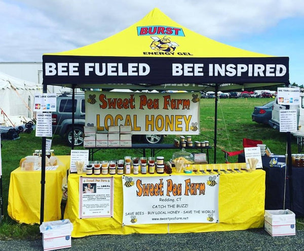
Every so often, a message truly resonates. Among the sea of options, one phrase stands out distinctly: "Bee Fueled, Bee Inspired." This farmer's market vendor's booth distinguishes itself not just by its honey products but by its compelling narrative wrapped around this memorable slogan.
- It's Fun and Witty: We all love a good pun. The play on "bee" and "be" is not just clever, but it also immediately tells you about the product. And who doesn't smile at a witty wordplay?
- Branding That Sticks: With the bustling bee mascot, the golden hues of the stall, and this catchy phrase, the entire setup becomes an unforgettable experience. It's not just about buying honey; it's about joining a story.
- Taste Before You Buy: The availability of honey samples, presented with wooden sticks, offers potential buyers an immediate taste experience. It's a tactile invitation, allowing customers to savor the flavor, appreciate the texture, and truly understand the quality before making a purchase. This hands-on approach bridges the gap between vendor and customer, fostering trust and emphasizing transparency in every drop.
Healthy, Handmade, and Honest: The Triad of the "PALEOGO" Pitch
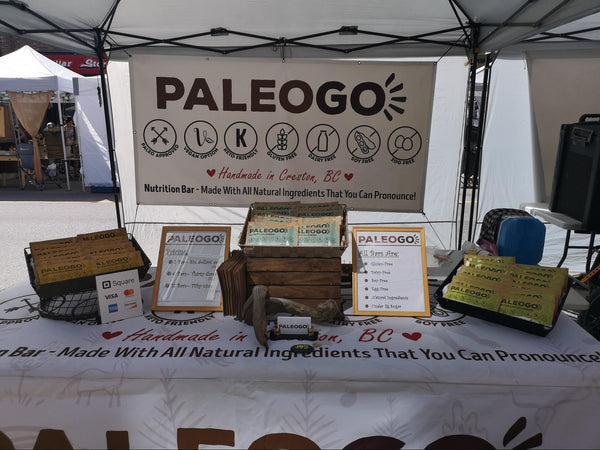
From the get-go, this vendor booth does an excellent job of communicating to a specific audience: those who value health, transparency, and locality. The use of clear icons, direct statements, and consistent branding all come together to create a compelling presentation.
- Clear Branding with Name and Icons: The hanging banner prominently features the brand name "PALEOGO" flanked by a series of icons. Each of these icons represents a value of their product.
- Location Authenticity: Just beneath the brand name, it's stated that these nutrition bars are "Handmade in Creston, BC." This speaks volumes about the product's authenticity and locality. Shoppers keen on supporting local businesses will surely appreciate this.
- Transparent Ingredients: The phrase "Made With All Natural Ingredients That You Can Pronounce!" is more than a tagline. In the age of organic and health-conscious living, this statement directly assures customers of the product's quality and transparency. There's an implied promise that these bars don't contain any mysterious chemicals or hard-to-pronounce additives.
Stepping Inside Sustainability: The Invitational Design of MOM's
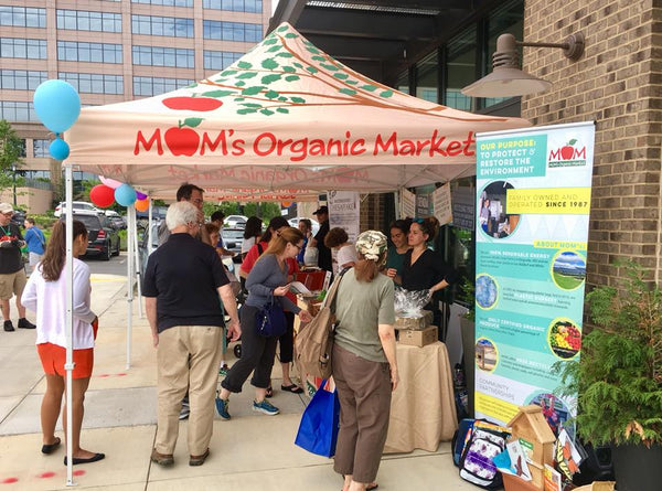
The strategic design and arrangement of the MOM's Organic Market booth showcase how brands can optimize physical spaces to engage with their audience more deeply. By creating an environment that encourages interaction, learning, and intimacy, they're not just making a sale but forming connections.
- Inviting Setup: By placing tables at the back, the booth immediately invites attendees to step inside, creating an interactive experience. This arrangement naturally promotes engagement and fosters a sense of intimacy and connection.
- Brand Storytelling: The prominently displayed banner on the right tells a compelling story about MOM's Organic Market. Their purpose statement — "To protect & restore the environment" — not only communicates what they do but why they do it. This resonates with eco-conscious consumers who are not just buying products but are investing in a cause.
- Established Trust: Highlighting that they're "Family Owned & Operated Since 1987" establishes trust. It tells customers that they've been in the business for a long time, ensuring reliability and expertise.
The Art of Consistent Farmer’s Market Vendor Booth Design

Vida Integrated Health exemplifies the nuances of crafting an engaging farmers market vendor booth. With the right blend of aesthetics, functionality, and human touch, they've created a space that beckons, informs, and engages.
- Unified Branding: At first glance, the black farmer's market canopy tent adorned with white and orange graphics captures attention. The stark contrast ensures that Vida's branding, especially its emblematic petal/flame logo, stands tall amidst the sea of vendors.
- Color Schemes providing Cohesion and Consistency: The beauty of a vendor booth often lies in its color palette. Here, Vida's use of vibrant orange across chairs, custom table cover with logo, balloons, and even staff shirts crafts an inviting and harmonized appearance, drawing visitors in with its warmth.
- Creating Interactive Spaces: More than just a booth, Vida offers an experience. The chairs invite visitors to sit, chat, and perhaps even get a swift consultation. This approach not only promotes longer interactions but might also translate into tangible business opportunities.
- The Human Touch: No booth shines without its staff. Dressed in branded tees and exuding a welcoming aura, Vida's team amplifies brand visibility and establishes a rapport with the passersby, turning casual glances into engaging conversations.
Uniformity in Display: Cohesiveness in Wild Root's Presentation
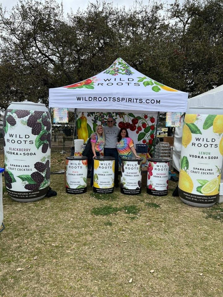
In an era dominated by digital marketing campaigns, the hands-on attraction of the vendor booth holds its ground. Behold "Wild Roots" - a brand that artfully combines contemporary innovation with age-old display arts, etching an enduring presence.
- Blowing Up the Market with inflatable product replicas: No longer just for parade floats or children's parties, inflatable replicas have stormed the vendor space, and Wild Roots is leading the charge. These towering representations of their beverage offerings not only provide a larger-than-life visual appeal but instantly convey the brand's product range to any passerby.
- Podiums with Purpose - Customized Displays for Each Product: Each product gets its stage, quite literally. The brand's podiums, custom-designed to showcase each flavor, make for a multi-tiered visual treat. This approach ensures that visitors can understand the product range at a glance, ensuring efficient communication in the hustle and bustle of an event.
- Vivid Imagery - Banners That Pop: Drawing inspiration from nature, Wild Roots' banner boasts an array of bright, vivid fruits, aptly representing the natural flavors infused in their spirits. This not only communicates the brand's commitment to quality ingredients but also adds a splash of color, creating a vibrant backdrop.
Discover the Magic Behind Bone Hook Brewing Co.'s Booth Strategy
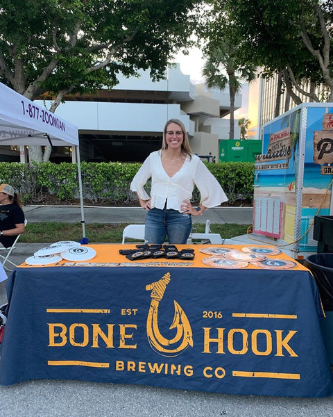
At the heart of Bone Hook Brewing Co.'s success at the farmer's market lies a fusion of tangible brand reminders and genuine human interaction. Whether it's through memorable merchandise or heartfelt connections, they've mastered the art of booth engagement.
- Merchandise as Brand Ambassadors: Bone Hook Brewing Co. understands that a brand is more than just its products. By offering collectibles like coasters and pins, they extend their identity beyond the booth. These takeaways serve a dual purpose - acting as conversation starters and embedding the brand in attendees' memories.
- The Human Connection: The most memorable stalls are those where you feel seen and appreciated. The casually-dressed hostess embodies this philosophy, presenting a warm and inviting facade. Her genuine smiles and interactions convert casual visitors into potential loyal customers, emphasizing that Bone Hook Brewing Co. values relationships over mere transactions.
Hot Dog Pete's: A Masterclass in Brand Consistency
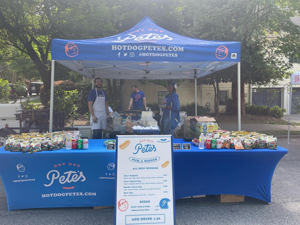
Ever wondered what makes a simple hot dog stand transform into a visual spectacle in a crowded marketplace? Hot Dog Pete's has unlocked this secret with its commitment to brand consistency.
- Color Cohesion: Embracing the Blue Palette - The predominant hue capturing attention is the rich, serene shade of blue. This color features prominently in the custom canopy tent, the custom printed tablecloth, and the merchandise. Through the consistent use of this shade, Hot Dog Pete's establishes a distinctive identity that's recognizable even from afar.
- Typography and Iconography: Crafting a Unified Voice - Consistent fonts used on the banner, tent, and menu board impart a singular voice to the brand. The playful icon depicting a hot dog with facial features amplifies brand recall. This mascot-like emblem positions the brand as approachable and endearing, leaving a lasting impression on onlookers.
- Uniformity: A Statement in Team Attire - The staff showcases brand alignment with attire consistent with the overarching blue theme. This cohesive appearance doesn't just exude professionalism but also aids patrons in swiftly pinpointing team members for queries or assistance.
Strategic Brand Presentation in an Open-Air Setting

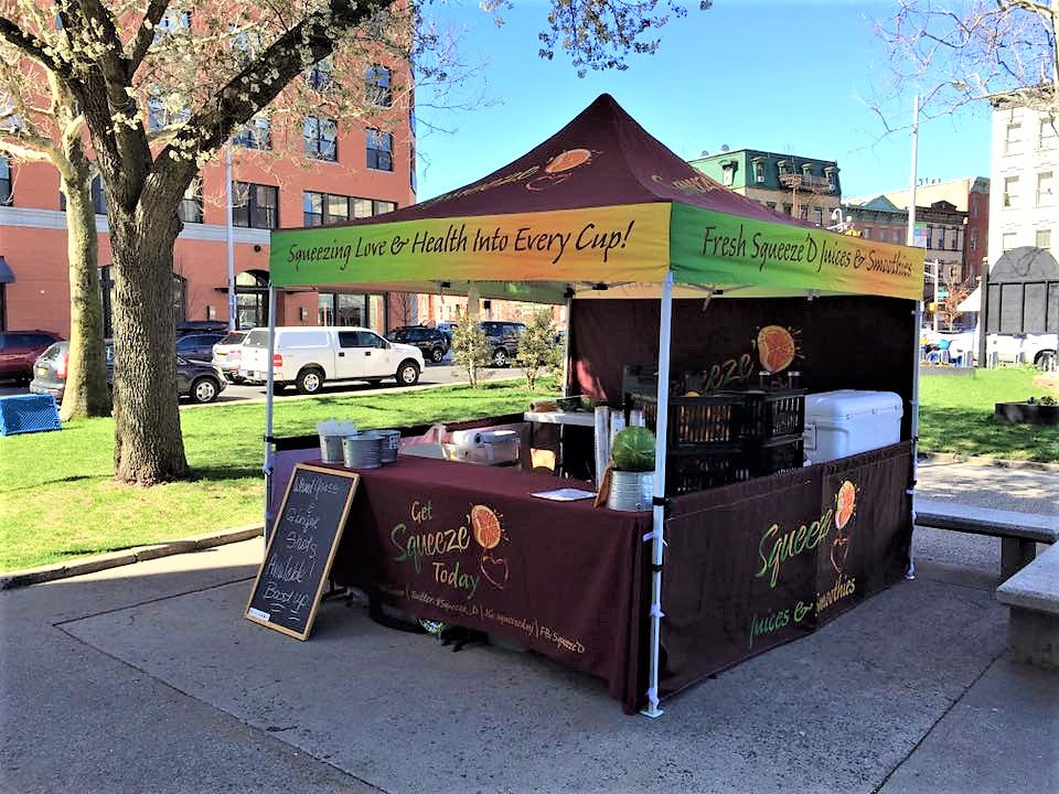
Incorporating a custom tent with wrap-around half walls not only sets a functional booth but also carves out a strong brand identity in a bustling farmer’s market. This design choice demonstrates an intricate blend of functionality and branding, ensuring that the stall stands out.
- Visibility From Multiple Angles: The wrap-around half walls ensure that the brand message is visible from multiple sides. Whether a customer approaches from the front, left, or right, they're greeted with cohesive branding, making it hard to miss in a crowded marketplace.
- Clear Messaging: The words "Squeezing Love & Health Into Every Cup!" and "Fresh Squeezed Juices & Smoothies" are strategically placed on the farmer's market tent canopy. This positioning allows for the brand's message to be easily seen from a distance, even if the customer is looking from an elevated position or from across the street.
- Functional and Aesthetic Benefits: The half walls provide a degree of separation from neighboring stalls, creating a more intimate space for transactions. Moreover, the walls offer protection from elements like wind, ensuring that the products and the vendor's belongings remain secure.
The Blueprint for Success
If there's one thing we've learned from observing standout farmer’s market booths, it's that a memorable farmer's market stall is built on the pillars of visibility, engagement, and authenticity.
Whether you're a first-timer or a veteran vendor, implementing these innovative ideas can help you lay down the blueprint for long-term success. So put on your creative cap and architect a space that transforms every passerby into a potential loyal customer.
