Picture this: You're navigating a bustling trade show, a maze of booths each vying for attention. Yet, amidst this sea of competition, one exhibit stands apart, a beacon drawing visitors like a magnet.
What's their secret?
Explore the art and science of trade show booth setup, where each element is a piece of a larger audience engagement puzzle. MVP Visuals’ guide, rich in trade show booth ideas, features standout components, showcasing Ritual Coffee Roasters' and Wild Roots Spirits’ eye-catching inflatable cans, both highlighting the innovative use of inflatables to captivate and attract the crowd.
Delving into the effectiveness of strategic displays, EMKA Technologies' approach stands out with expansive backdrops and sleek, brand-color-coordinated custom table covers that transform into comprehensive educational tools. Similarly, Biomass excels in using multiple custom banners, each meticulously crafted for educational purposes, to provide an in-depth exploration of their specialized field.
Inflatable Impact: Wild Roots Spirits’ Larger-Than-Life Product Display
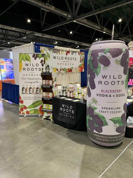
Check out the giant inflatable can that makes this booth irresistible to visitors
Turn Your Product into Giant Inflatable
Looking to make the most of a 10x10 trade show space at your next trade show? Wild Roots Spirits shows us how it's done with flair and strategy. Their setup is a fantastic example of maximizing a compact area to create an inviting and vibrant booth.
- Eye-Catching Visuals: Wild Roots Spirits transforms their 10x10 booth into a visual feast with a backdrop that's a colorful ode to their fruit-infused spirits. The lush imagery of berries and fruits isn't just appealing; it tells a story of natural ingredients and flavor, which is exactly what you see on their tasting table.
- Oversized Product Replica: They've got this oversized inflatable that’s hard to miss—a giant replica of their Blackberry Vodka & Soda. It’s a smart move because it not only adds dimension to the space but also serves as a conversation starter and a photo op, drawing people in.
- Tastefully Arranged Products: On their table, bottles are arranged with care—not too crowded, each label clearly visible. It gives visitors the chance to take in their product range at a glance without feeling overwhelmed, which is key in a 10x10 space set up.
Visual Thirst Quencher: The Art of Trimino’s Product Showcase
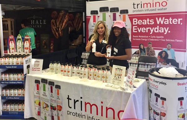
If you're looking to make a splash at your next trade show, here's some inspiration from Trimino. Their booth is a blueprint for sleek, product-focused presentation with a clear message. Let's dive into what makes their setup work:
- Product Showcase Perfection: Trimino's booth is a standout with its clean, organized display of protein-infused waters. By presenting their bottles in neat rows and clear signage, they make it easy for visitors to spot their variety of offerings from across the floor.
- Engaging Brand Ambassadors: With friendly faces sporting branded gear, Trimino’s staff are ready to welcome you, hand out samples, and chat about the benefits of their beverages. Their approachable demeanor invites interaction and discussion, drawing visitors in for a closer look.
- Clear, Concise Messaging: Their backdrop says it all – "Beats Water, Every day." It’s a bold statement that cuts through the noise, supported by bullet points on how their product stands out. This kind of messaging sticks with visitors, offering them the key takeaways at a glance.
Small Footprint, Big Impact: How Cusa Tea Maximizes 10x10 Trade Show Booth
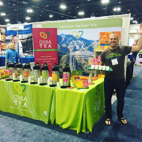
In the bustling world of trade shows, Cusa Tea showcases how to make a 10x10 trade show booth pop with vibrant colors and smart branding. Their approach is a great example for any business looking to make a lasting impression in a compact space.
- Vibrant Color Scheme: The bright green tablecloth with the Cusa Tea logo is instantly eye-catching. It's fresh, it's lively, and it screams natural and healthy — perfect for drawing in health-conscious consumers.
- Product Sampling Done Right: With a neat row of dispensers ready for sampling, Cusa Tea invites passersby to taste their premium instant tea on the spot. This hands-on approach not only delights the senses but also provides a personal experience with the brand.
- Clear Brand Messaging: Their backdrop boasts a large, clear image of mountains with the tagline "Premium Instant Tea," driving home their message of quality and instant enjoyment. It's a smart use of imagery that speaks to the natural origins of their product.
Sportstickers' Inviting Canopy-Centric Booth Design
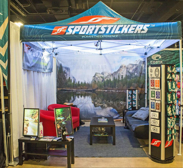
Expert usage of customized canopy tent to create an inviting space
Shop Custom Pop Up Tent
For those looking to create a standout 10x10 booth that resonates with an active lifestyle brand, Sportstickers sets a fantastic example. Here's the scoop on how they've tailored their space to create an inviting and brand-centric environment.
- Themed Environment: With a canopy that replicates the great outdoors, Sportstickers transports visitors right into the heart of nature. It's more than just branding; it's about crafting an experience, #CraveTheExperience as they aptly hashtag it.
- Comfortable Seating Area: They’ve cleverly turned their booth into a cozy lounge with inviting red chairs and a couch, encouraging visitors to sit down, relax, and engage with the brand in a comfortable setting.
- Visual Product Display: The tall, vertical display full of vibrant stickers not only shows off the product range but also adds to the booth’s dynamic feel. It’s practical, too, allowing visitors to browse the offerings without feeling crowded.
Biomass’s 10x20 Educational Trade Show Booth
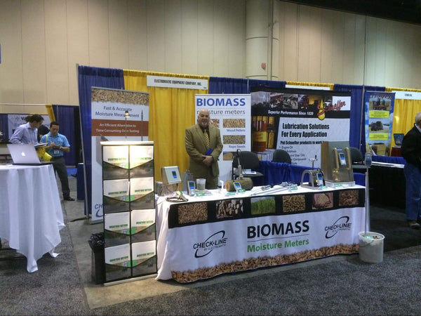
When it comes to a 10x20 booth setup at a trade show, the key is not just to inform but to educate. Biomass exemplifies this with their intelligently designed space that's as much a learning center as it is a product showcase.
- Educationally-Structured Layout: Biomass leverages their 10x20 space by creating distinct educational zones. Each section is dedicated to a different product, complete with informative signage, enabling visitors to gain a comprehensive understanding of the moisture meters' applications and intricacies.
- Informative and Instructional Displays: Biomass goes beyond mere information; they provide an educational journey with detailed posters and digital displays. These serve as mini-tutorials, articulating the benefits and technical specifications of their products, catering specifically to industry professionals in pursuit of detailed knowledge.
- Interactive Learning Stations: Biomass doesn't just display products; they facilitate hands-on learning through live demonstrations. This interactive approach allows visitors to experience the functionality and precision of the moisture meters, fostering a deeper educational engagement with the technology.
Backdrop to the Future: Emka Technologies’ Expansive Display of Innovation
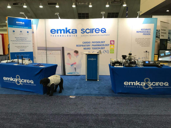
Expansive backdrop banners create a commanding presence
If you're looking to create a booth that communicates expertise and precision, look no further than Emka Technologies for inspiration. Their exhibit is a masterclass in using space effectively to project a professional image and engage visitors.
- Captivating Backdrop Banner: The backdrop commands attention with its crisp, clear branding and high-resolution imagery, making it a central feature that underscores Emka’s authority in scientific respiratory equipment.
- Custom-Fitted Tablecloth: The booth is sharply dressed with a custom-fitted tablecloth, reinforcing brand identity with consistent use of the company logo and color scheme. This polished look not only enhances visual appeal but also ensures that the brand is memorable.
- Hands-On Product Engagement: Front and center are the actual respiratory devices, inviting visitors to see the products in action. This approachable setup encourages interactive learning and demonstrates the practical application of their technology.
Ritual Coffee Roasters: Brewing Unforgettable Booth Experiences

For a brand that wants to create an unforgettable impression, Ritual Coffee Roasters' approach is a stroke of genius. Let's break down what makes their presentation shine:
- Vivid Brand Ambassador: They’ve brought in a lively and colorful brand ambassador whose larger-than-life personality and attire perfectly encapsulate the brand's vibrant and inclusive spirit. This clever move turns heads and ensures that attendees will stop for a second look or even a fun photo opportunity, creating a buzz around the booth.
- Bold Oversized Product Replica: Towering next to their ambassador is an oversized replica of a Ritual coffee can. This not only acts as a landmark within the event space, drawing attendees in from a distance but also reinforces the product in a fun and memorable way.
- Eye-Catching Graphics: The booth's backdrop features bold, cartoonish graphics that give off a hip and modern vibe, in tune with the company's branding. It's an effective visual strategy that captures the essence of Ritual's unique approach to coffee.
Riptide Builders: An Oasis of Opportunity at the Outdoor Trade Show
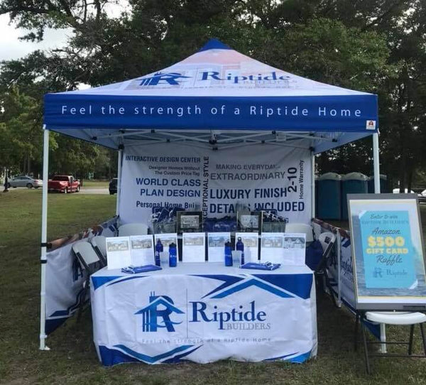
For those with an eye for detail and a dream of custom homes, Riptide Builders' booth is a beacon of inspiration. Here's how their outdoor trade show setup shines:
- Branded Canopy Tent: Dominating the landscape, the Riptide Builders' tent soars with the company's logo prominently displayed. This distinctive blue and white canopy not only offers a respite from the outdoor elements but also serves as a landmark for quality home craftsmanship, inviting passersby to explore the possibilities of luxury home building.
- Cohesive Color Story: Echoing the brand's maritime-inspired name, the booth is a wave of tranquility in blue and white. This thoughtful color scheme reinforces the brand's identity, suggesting a promise of serenity and strength akin to the ocean's enduring presence.
-
$500 Gift Card Raffle: A Sure Draw: The booth's centerpiece is the enticing $500 Amazon gift card raffle. More than just a draw, it's a conversation starter, giving visitors a tangible reason to engage with Riptide Builders and remember the name long after the trade show concludes.
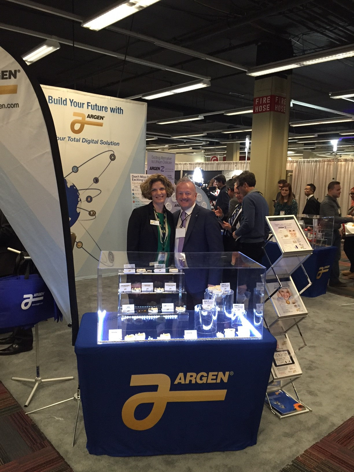
Efficient Space Utilization: Argen's Trade Show Mastery
Argen's trade show booth exemplifies strategic use of space, seamlessly combining brand identity with product display. Here's how they've tailored their trade show booth to captivate and engage attendees:
- Prominent Feather Flag: Standing tall among the hustle and bustle of the trade show is Argen's feather flag. It's not just a marker of location but a beacon of their brand, waving gently to draw visitors from afar. The height of the flag ensures visibility over other booths, leveraging vertical space to make a lasting impression.
- Cohesive Backdrop Design: The backdrop is a testament to understated elegance, featuring Argen's logo prominently against a deep blue, creating a professional and trustworthy atmosphere. This backdrop doesn't shout for attention; it confidently states Argen's presence and stability in the industry, aligning perfectly with their corporate branding.
- Product Showcasing on Crisp Table Cover: The fitted trade show table cover, in a rich, deep blue that matches the backdrop, offers an air of sophistication while highlighting the products. On it, precision-crafted dental products are displayed under bright lights within transparent cases, drawing the eye and inviting close inspection. The clean lines and uncluttered arrangement speak of precision and quality, key traits in the dental industry.
Key Takeaways for Building a Memorable Trade Show Booth
This guide has highlighted the essential strategies for a standout trade show presence, focusing on strategic trade show booth ideas such as the captivating draw of an inflatable product replica and the personalized engagement of interactive displays.
By integrating these concepts, from strategic design to clear messaging, you can transform your booth into a hub of activity that captures attention and fosters lasting connections. Implement these insights to ensure your exhibit resonates with attendees, leaving a powerful impression that extends well beyond the event itself.

