

Challenge Family × SAIL Challenge Cap Québec
Custom All-Terrain Branding for the 2024 North American Launch
Challenge Family returned to North America with a clear brief: bring its established race-day atmosphere into the center of Québec City. MVP Visuals built the branded structures that made every zone of the site unmistakably Challenge.
Project Snapshot
Floating Arches, LED Finish Arches, Custom Finish Tunnel, Tent Village, and branded table covers.

Setting the Tone in Québec
Challenge Family's 2024 return to North America had to feel current and unmistakable inside one of the oldest urban backdrops on the continent. Old Québec has its own visual gravity: the branding had to read from a boat without fighting the setting.
This site needed more than logos on scattered surfaces. It needed clear visual anchors. From Bassin Louise to the Dufferin-Montmorency corridor, the branding had to hold up in wind, read cleanly for athletes moving at race pace, and hold its color on broadcast and drone footage.

The Mission: Unify the swim course, finish area, and village into one visual environment, and make Challenge red and navy own a UNESCO World Heritage Site for three days.
Technical Phase: From Vector to Volume
 12ft_Floating_Arch_Proof.png
 Tunnel_Mockup_Final.psd
Before production started, every custom piece went through 3D modeling and layout review. In a pro race setting, a flat proof won't show you what inflation pressure and camera angles actually do to the geometry. The graphics had to read from the dock, the course, and the main camera positions, three very different distances and angles.
- The Design Challenge: The Challenge "Spur" and repeating graphic pattern had to wrap across curved surfaces without breaking apart at seams. Each panel was mapped individually so the spur pattern aligned precisely across seams once the structure was pressurized, with no drift.
- Color Matching: The same red and navy had to hold across 600D tent fabric, PVC-coated floating assets, and finish-line pieces. Dye-sublimation kept the palette consistent across the full kit.
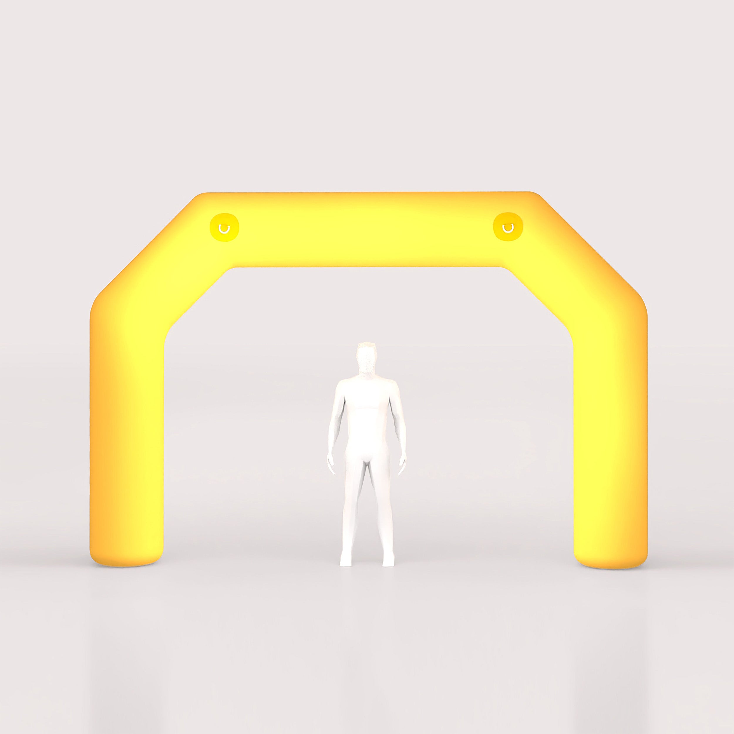
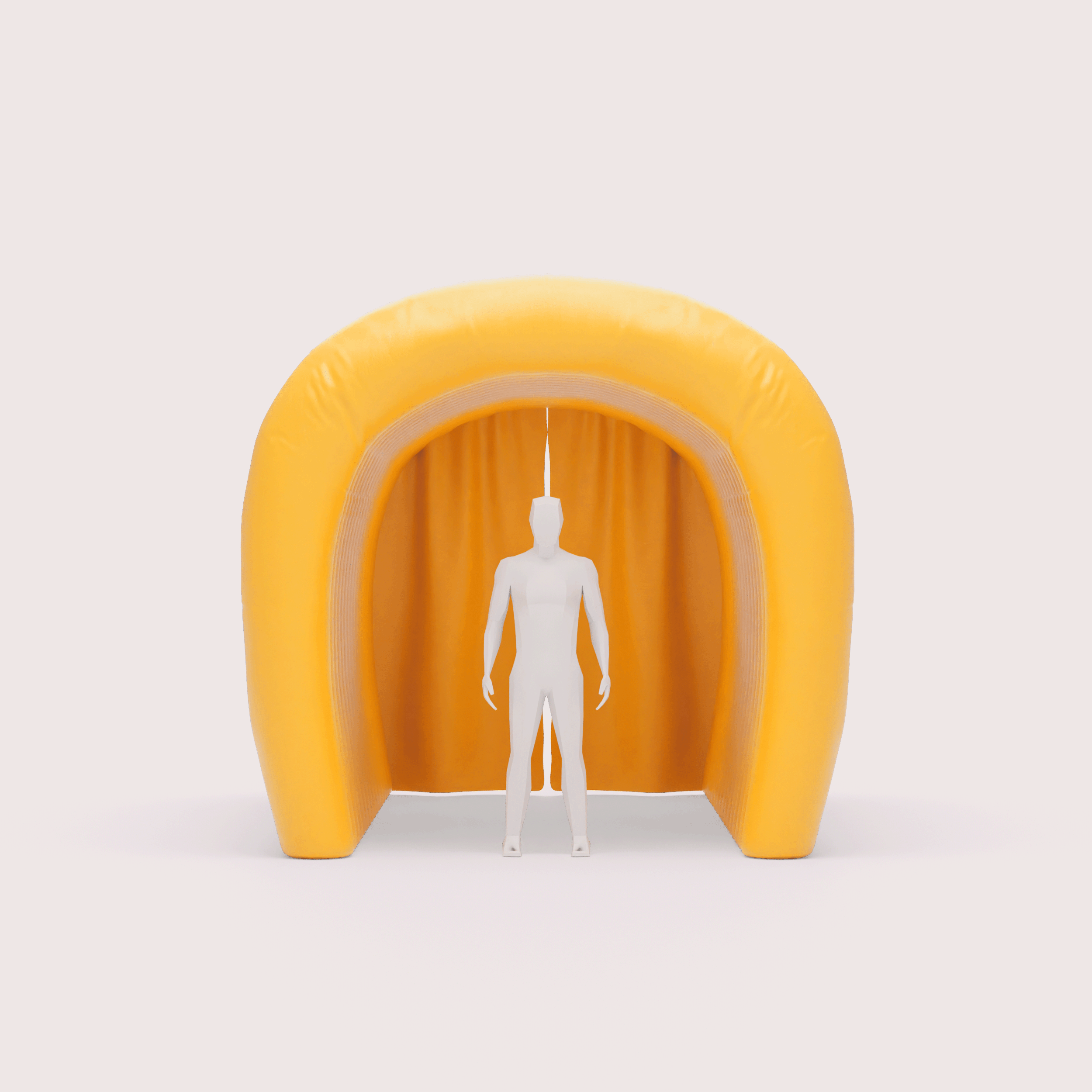
- Inflatable Engineering: The 24ft LED arches and 20ft finish tunnel had to stay firm in riverfront wind without losing shape on site or on camera.
Technical Field Notes
Panel Segmentation & Pressure Testing: The 20ft tunnel used a multi-panel build so the logo could wrap cleanly around the curve without warping. Every custom unit, including the floating arches, went through a 48-hour pressure-drop test on our production floor so day-one performance would still hold on day three.
Field Reality: Built for the Elements


The Saint Lawrence riverfront runs humid, gusty, and unforgiving across a three-day window in July. Over that stretch, these pieces had to handle steady foot traffic, shifting wind, and long hours in direct sun without losing shape or color.
- Durability Under Pressure: The tunnel and LED arches stayed upright and camera-ready all weekend. Heavy-duty materials, reinforced seams, and commercial blowers kept every form at full pressure through shifting wind and humidity over three days.
- UV & Color Integrity: July sun can wash a brand out fast. UV-resistant dye-sublimation kept the Challenge red on tents, arches, and course pieces consistent from Friday morning through Sunday's podium.
- Fast Deployment: The full kit was built for quick setup. Local crews could move from unload to full site build with very little on-site correction after inflation.
Product Spotlight I: Swim Exit Landmarks
What Athletes Saw Coming Out of the Water
In an open-water harbor swim, athletes spend the final stretch making decisions: where to sight, where to exit, where to go next. The 12ft and 20ft custom floating arches gave them a fixed marker at the swim exit and the run into Transition 1.
The Strategy: Placed at the mouth of the Bassin Louise exit, the arches created a gate athletes could pick up early from the water. That gave more than 1,000 participants a clean, unambiguous line into T1.
The Engineering: Floating inflatables deal with current, wake, and wind at the same time. Internal ballast and multi-point tethering kept these arches upright and centered through movement on the harbor.
Visibility From Every Angle: Full-wrap dye-sublimation on heavy-duty PVC kept the Challenge "Spur" readable from the water, the docks, and nearby spectator areas during one of the most photographed moments of the race.
A Stable Marker Is Part of the Course
The swim-to-bike transition is one of the busiest parts of the day. A large, stable exit marker gave athletes a clearer line, gave the site more order, and helped the whole venue feel more like a pro event the moment people hit land.
Product Spotlight II: The Finish Line System


The finish line is where the photos are taken, where sponsors need to be visible, and where broadcast clips get made. It's the frame everything else is judged against. The custom LED arches and 20ft finish tunnel turned that zone into a finish environment that held up on phones, long-lens stills, and live broadcast at the same time.
Sponsor Placement: For partners like SAIL and Argon 18, that zone had to pay off on camera. Branding on the arch headers and tunnel walls stayed visible in tight finish shots and wide drone passes.
Low-Light Visibility: Race days start early and often end under dim light. Internal LEDs kept the finish structure readable during pre-dawn setup, early starts, and later awards coverage.
Custom Geometry: The finish structure moved away from a generic pill shape and gave the venue a sharper silhouette. Even with internal lighting and river wind, the inflated form held its shape from the first finisher to the last.
Sponsor Visibility Doesn't Clock Out
A lot of race branding disappears before sunrise or after sunset. This setup kept the finish line legible across the full day, which matters when the same sponsor assets need to work in setup photos, race footage, and finish-line celebration shots.
Product Spotlight III: The Village Kit

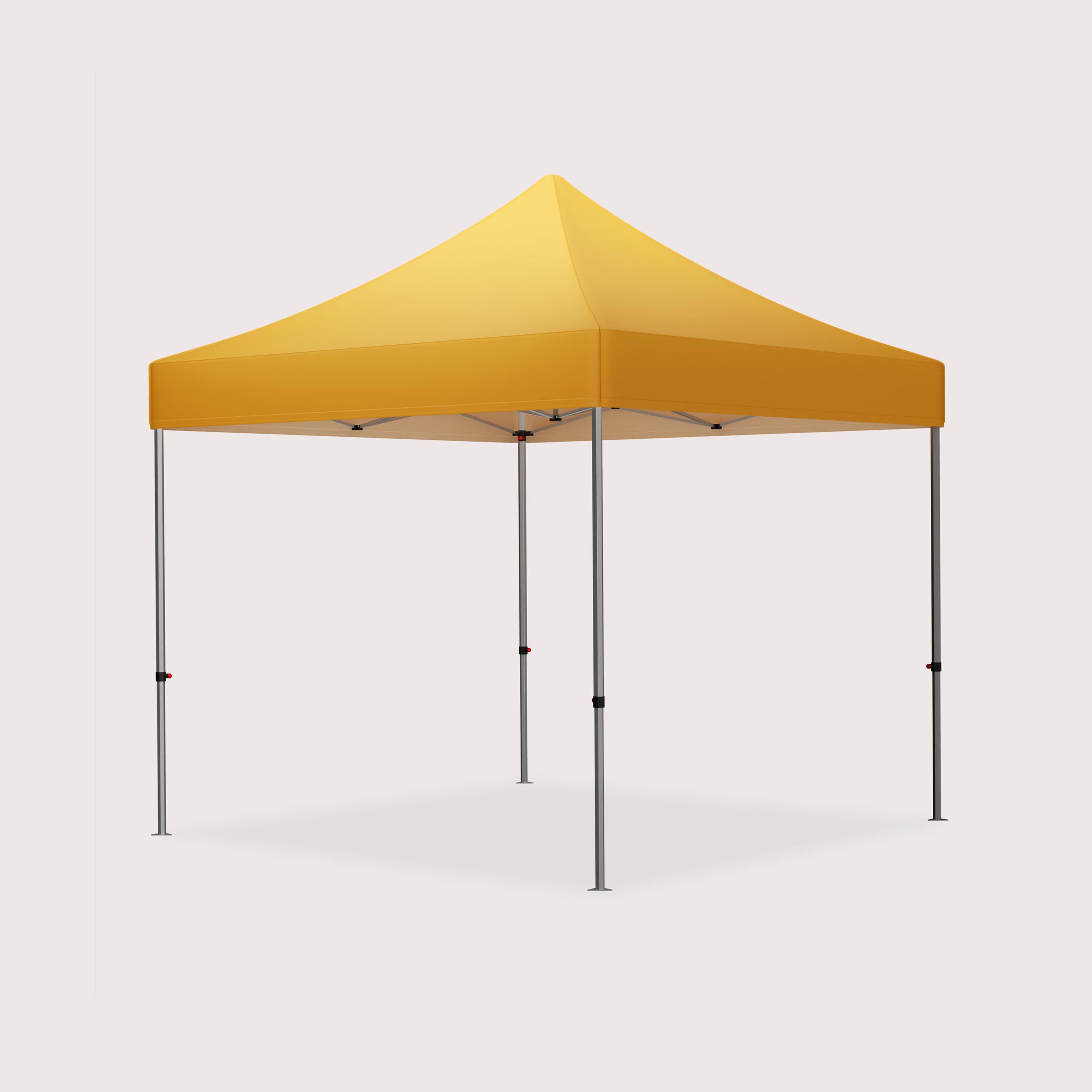
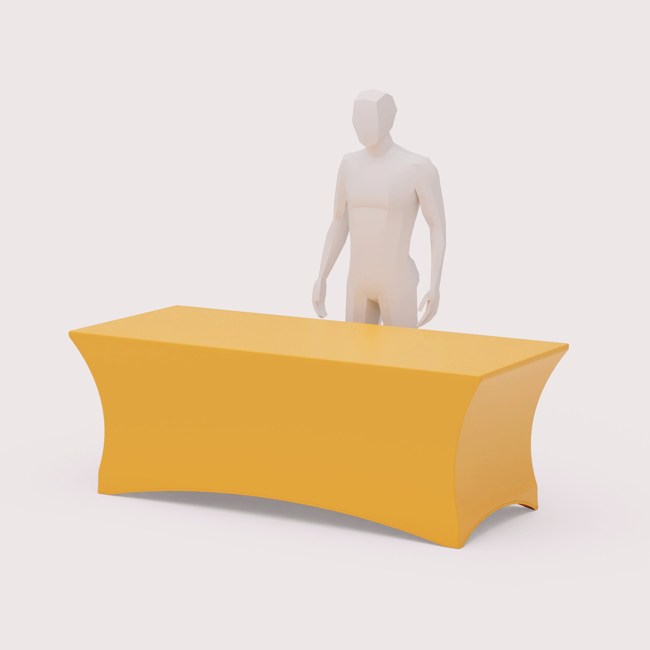
The inflatables set the landmarks, but the rest of the site had to carry the brand between the big moments. The Québec kit included 150+ Teardrop Flags, 40+ Custom Tents, and 40+ Table Covers so the event looked consistent from registration to the final chute.
- Course Atmosphere: Teardrop flags lined the Saint-Charles River path, helped define the run course, and gave spectators and sponsors a stronger visual presence.
- Operations Hub: The 10x10 and 10x20 tents handled registration, staff operations, recovery, and VIP areas. Heavy-duty frames and weatherproof canopies kept those spaces usable in humid, windy conditions.
- Athlete Touchpoints: Table covers handled the smaller moments that still matter. Bib pickup, information tables, and finisher services all carried the same branding standards as the larger structures.
Why the Smaller Pieces Matter: Consistency matters as much as the hero pieces. Treating tents, flags, and table covers as one kit meant the crew could walk into a public plaza and have it reading as a fully built event site within hours of unload.
The Result
The Québec launch held up on camera. But the stronger result was how organized the site felt for the people actually inside it. Athletes moved through a course that read clearly and felt fully built out from water exit to finish line.
The inaugural SAIL Challenge Cap Québec won the 2024 "Best Run Course" Award. Athletes voted for it, and the fully built course environment was part of what they remembered.
The project covered concept review, 3D modeling, production, and field deployment. Together, those pieces gave Challenge Family a strong model for future North American events and gave Québec a debut that looked and ran like an established stop on the circuit.


